


The way you format your resume is a key part of your career story. You have about five seconds to get a recruiter's attention. A smart layout makes your best skills stand out.
Choosing a Resume Format That Works for You
First, you need to pick a framework for your resume. This is a very important decision. It decides how recruiters and software see your work history. Just as there are different writing formats for various documents, your resume needs the right structure.
The three main formats are chronological, functional, and combination. Each one tells your story in a different way.
The Chronological Format
This is the most common format. It lists your work history from your most recent job to your oldest.
This format is great if you have a steady career path. It is clean and easy to read. Hiring managers can see your job growth clearly.
The Functional Format
A functional resume focuses on your skills. It highlights what you can do, not where you worked. The work experience section is usually short.
This format is helpful if you are changing careers. It is also good for people with gaps in their employment. It lets you show skills that match the new job, even if your timeline isn't traditional.
The Combination Format
The combination format mixes the best parts of the other two. It starts with a strong skills summary. Then, it lists your work history in chronological order.
This option is great for experienced professionals. It lets you show both your specific skills and a solid work history. Many businesses now focus on skills-first hiring. This format meets that need. Recruiters also find it helpful, as many struggle to find candidates with the right skills.
If you are unsure which format to use, this decision tree can help.
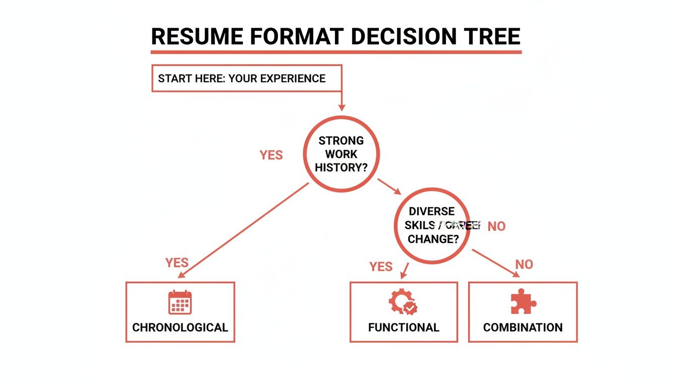
This visual is a quick tool. It connects your background to the best resume structure for you.
Which Resume Format Is Right for You?
Use this table to choose the best format for your career.
| Format Type | Best For | Key Feature |
|---|---|---|
| Chronological | Professionals with a consistent career path. | Highlights a strong work history and clear progression. |
| Functional | Career changers or those with employment gaps. | Emphasizes transferable skills over a timeline. |
| Combination | Experienced professionals with strong skills and a solid work history. | Shows both a skills summary and a detailed work history. |
Your resume format is the foundation of your professional story. A good layout makes your skills easy to see. It helps you make a strong first impression.
Structuring Your Resume for Maximum Impact
Think of your resume like a valuable property. The most important information should be at the top. Recruiters should see it in their first quick scan. The structure of your resume guides their eyes to your best qualifications.
This is not just about listing jobs. It is about building a story. Each section should lead to the next. It should make a clear case for why you are the right person for the job.
The Essential Resume Sections
Every good resume has a few key sections. You might change the order based on your format. But these parts are necessary for a professional resume.
Here are the sections you need:
- Contact Information: Place this at the very top. It should be clean and easy to find. Include your full name, phone number, a professional email, and your city/state.
- Professional Summary: This is a short, two-to-three-sentence pitch. It sits right below your contact information. It should grab the reader's attention with your top skills and wins.
- Work Experience: This is the main part of your resume. Here, you list your past jobs. Describe your duties and, more importantly, what you accomplished.
- Skills: Create a separate section for your skills. List both technical (hard) and personal (soft) skills. This helps you get past screening software and catch a recruiter's eye.
- Education: List your degrees, universities, and graduation dates.
These five sections form the backbone of a great resume. If you get them right, you will create a document that opens doors for you.
Crafting a Powerful Professional Summary
Your summary is the first thing a recruiter reads. It needs to be strong. Avoid vague phrases like "Hard-working professional seeking a new opportunity." This says nothing about you. Focus on the value you provide.
Think of it as a short highlight reel of your career. Start with your job title and years of experience. Mention a few key skills relevant to the job. Then, share a big accomplishment that proves your ability.
Here is a weak summary:
Motivated marketing manager with experience in social media and content creation looking for a challenging role.
And here is a strong one:
Digital Marketing Manager with 8+ years of experience driving brand growth through data-driven SEO and content strategies. Successfully increased organic traffic by 150% for a leading e-commerce brand by overhauling its content marketing program.
The second example is specific. It uses numbers to show impact. It tells the recruiter what this person can achieve.
Showcasing Your Work Experience with the STAR Method
Your work experience section should not be a list of duties. It needs to show your achievements. The STAR method is a simple way to frame your accomplishments so they stand out.
STAR stands for:
- Situation: Briefly describe the challenge or context.
- Task: Explain your specific responsibility.
- Action: Detail the specific steps you took.
- Result: Quantify the outcome with numbers or clear results.
Instead of writing "Managed social media accounts," use the STAR method. It becomes a powerful point: "Increased social media engagement by 45% in six months (Result) by developing and launching a targeted content calendar (Action) to revitalize underperforming platforms (Situation/Task)."
This change turns a simple duty into an impressive achievement. It proves you made a real contribution. This is a key skill when learning how to format a resume for results.
Adding Optional Sections That Add Value
You can add a few optional sections to stand out. But only include them if they are relevant to the job. Do not add sections just to fill space.
Consider adding:
- Certifications: List any professional certifications for your industry.
- Projects: This is great for developers, designers, or anyone with a portfolio.
- Volunteer Work: This can show valuable skills, especially if you have limited work experience.
A well-structured resume is easier to read. Organize your information logically. Focus on your achievements. This creates a powerful document that holds a recruiter's attention. Building a resume is easier with the right tools. You can explore quality templates and create your own with GainRep's resume builder.
Mastering Design and Layout for Readability
How your resume looks is as important as what it says. A messy document can get your application rejected quickly. A few key design rules will make your resume clean, professional, and easy to read.

Every visual detail makes a first impression. Getting these details right guides the reader's eye to your most impressive qualifications.
Single-Column vs. Double-Column Layouts
One of the first design choices is the layout. The single-column format is the classic choice. It lists all your information in one stream from top to bottom. This makes it the safest option for Applicant Tracking Systems (ATS).
A double-column format can look more modern. It lets you fit more information on one page. But it has a major risk. Many ATS bots cannot read multiple columns correctly. Your resume could become a jumbled mess.
Many job seekers use two columns to save space, but it is a big risk. A large number of resumes are rejected by an ATS before a person sees them. Stick with a single-column layout to give yourself the best chance. You can look at the latest resume statistics to see why this is a smart choice.
Choosing Professional Fonts and Sizes
The font you choose says a lot about you. Stick with clean, sans-serif fonts. They are easy to read on screens and paper. Avoid decorative or script fonts. They look unprofessional and are hard to read.
Here are a few solid font choices:
- Calibri: Modern, clean, and a common default.
- Arial: A classic that is always easy to read.
- Helvetica: A favorite of designers for its clean lines.
- Roboto: A friendly yet professional font from Google.
Keep your font sizes consistent. This creates a clear visual order. It helps recruiters find information quickly.
Pro Tip: Use a slightly larger font for your name and section headings. Use 10-12 point font for the main text. Use 14-16 point font for headings. Do not go smaller than 10 points.
The Power of White Space
White space is the empty area around your text. It is very important for resume formatting. A resume packed with text is hard to read. It feels overwhelming.
Using white space well makes your resume look organized and professional. It gives the reader's eyes a break. It also creates clear separation between sections.
Focus on these three things to use white space effectively:
- Margins: Keep your margins between 0.5 and 1 inch on all sides. This creates a clean frame for your content.
- Line Spacing: Use a line spacing of 1.15 to 1.5 for your text. Single spacing is often too dense. Double spacing can look too empty.
- Space Between Sections: Add extra space before each new section heading. This creates a visual break and improves the flow.
These small changes can make a big difference. They can turn a dense document into a polished resume. When learning how to format a resume, remember that clarity is most important. A great design is clean, not flashy.
You can get a head start with pre-designed templates from a tool like the GainRep resume builder. This ensures your layout is professional and ATS-friendly from the start.
Writing Bullet Points That Showcase Your Value
The work experience section is the core of your resume. It is your chance to prove you can deliver real results. Just listing your daily tasks is not enough. You have to show your impact.

The secret is to turn your responsibilities into achievement-focused bullet points. This is how you show, not just tell, why you are the best candidate.
Start with Strong Action Verbs
The first word of each bullet point is very important. Weak phrases like "Responsible for" are not effective. They make your accomplishments seem less impressive. Start every point with a strong, dynamic action verb. It should describe what you actually did.
This simple change makes your contributions feel more direct. For example, instead of saying you were "part of a team that launched a new product," say you "Collaborated with a cross-functional team to launch…" This puts you in an active role.
Here are some examples of powerful verbs:
- For Management: Orchestrated, Spearheaded, Directed, Mentored, Optimized
- For Sales: Generated, Secured, Negotiated, Exceeded, Acquired
- For Technical Roles: Engineered, Developed, Architected, Programmed, Automated
- For Creative Roles: Designed, Conceptualized, Produced, Composed, Illustrated
Using different verbs makes your experience section more engaging. It paints a clearer picture of your abilities.
Quantify Your Accomplishments with Numbers
Numbers provide proof. They speak louder than vague descriptions. When you add data to your bullet points, you show your value clearly. Hiring managers love metrics. They show the return on investment they can expect from you.
Look for chances to add numbers, percentages, or dollar amounts. Did you increase sales? By how much? Did you make a process more efficient? How much time or money did you save?
Do not just say you improved efficiency. A statement like, “Streamlined the reporting process by implementing new software, reducing manual data entry by 15 hours per week” is much more powerful.
You can often make a good estimate even if you do not have exact figures. Think about the scale of your work. Consider the number of people on your team or the size of the budget you managed.
Tailor Your Bullet Points to the Job Description
Sending the same generic resume for every application is a big mistake. You must customize your bullet points for each specific job.
Start by carefully reading the job description. Find the key skills and qualifications the employer wants. These are your keywords.
Then, review your own work history. Find examples of when you used those exact skills. Rewrite your bullet points to highlight these accomplishments. Use the same language from the job description when it makes sense. This shows the hiring manager you are a perfect match.
Weak vs. Strong Bullet Point Examples
Seeing a before-and-after example makes this clear. Let’s look at how these rules can improve a bullet point.
Example 1: Marketing
- Weak: Handled the company’s social media accounts.
- Strong: Grew organic social media following by 40% across three platforms in one year by developing and executing a data-driven content strategy.
Example 2: Project Management
- Weak: Responsible for managing project timelines.
- Strong: Successfully managed a $250,000 project from conception to completion, delivering it two weeks ahead of schedule and 10% under budget.
Example 3: Customer Service
- Weak: Answered customer emails and phone calls.
- Strong: Resolved an average of 50+ customer inquiries daily, achieving a 95% customer satisfaction rating through prompt and effective communication.
Each strong example starts with an action verb. It includes hard numbers. It focuses on the result of the work, not just the task. This approach turns your resume into a persuasive marketing tool. A solid tool like GainRep's resume builder can give you a professional foundation to build upon.
Finalizing Your Resume for a Flawless Submission
You have done the hard work. You picked the right format and polished your experience. Now, it is time for the final step. Do not rush this last check before you click "send."
A single typo can be a big red flag for a hiring manager. It can suggest a lack of attention to detail. This is not the first impression you want to make. Careful proofreading is essential.
Proofreading for Perfection
Your brain can play tricks on you after looking at the same document for hours. You see what you meant to write, not what you actually wrote. You need to look at the text with fresh eyes.
Here are a few effective ways to do that:
- Read It Aloud: This forces you to slow down. You will catch awkward phrases that your eyes might miss.
- Go Backward: Start with the last word and read your way to the top. This breaks the normal flow and helps you spot typos.
- Change the Scenery: Print the document. Or, change the font, color, or text size on your screen. A different look can make errors stand out.
- Phone a Friend: Ask a trusted friend or mentor to review it. A fresh set of eyes can often find something you missed.
Proofreading is not just about typos. It is about making sure your resume is clear, consistent, and professional.
Naming Your File Like a Pro
Your file name is the first thing a recruiter sees. A generic name like "Resume.pdf" is a mistake. It gets lost among other applications. It also makes more work for the recruiter.
A professional file name is clean and easy to identify.
Use a consistent format. The industry standard is clear:
FirstName-LastName-Resume.pdf
For example, "Jane-Doe-Resume.pdf" looks polished and is easy to find. This small detail shows you are organized.
Choosing the Right File Type
The file type you choose preserves your formatting. For almost all cases, the answer is simple: PDF is king.
Saving your resume as a PDF locks in your formatting. The fonts, margins, and layout will look the same on any device. A Word document can look different on other computers. This can ruin your careful design.
The only exception is if the job posting specifically asks for a Word document. Some older systems still prefer them. Always follow the application instructions exactly.
A great resume is a start. But a standout application often includes more. Learning how to write a cover letter that gets you hired can give you an extra edge.
With your polished documents ready, you can streamline the application process. Services like GainRep's AI Auto-Apply can take your perfected resume and get it in front of the right people. This boosts your chances of landing interviews without the manual work.
Common Questions About Resume Formatting
Even when you feel confident, some questions about formatting can come up. Answering these questions can help you feel ready to submit your application. Let's go through some of the most common ones.
How Long Should a Resume Be?
For most people with less than 10 years of experience, the answer is one page. This is a practical rule. It forces you to include only the most valuable information.
A two-page resume is acceptable for senior executives with decades of relevant experience. But that is the maximum length. Your resume is a marketing document for a specific job, not your entire life story.
Every line on your resume must earn its place. It needs to prove you are right for the role. For students, recent graduates, and those early in their careers, a one-page resume is essential.
Should I Put a Photo on My Resume?
In the US, Canada, the UK, and many other countries, the answer is a firm no. A photo can lead to unconscious bias. Many companies have policies against photos to ensure a fair hiring process.
There is also a technical reason. Applicant Tracking Systems (ATS) can be confused by images. A photo might cause the system to misread your information or even reject your application. Let your skills and experience speak for themselves.
The only exceptions are for jobs where appearance is important, like acting or modeling. For everyone else, leave the photo off.
What Are the Biggest Resume Formatting Mistakes?
A few common mistakes can ruin a good resume. The most frequent error is trying to fit too much information on the page. This leads to tiny fonts, small margins, and a wall of text. It is a major turn-off for recruiters.
Other common mistakes to avoid include:
- Typos and Grammatical Errors: These suggest carelessness. Always proofread multiple times.
- Unprofessional Fonts or Colors: Stick with classic, clean fonts. Avoid distracting colors or graphics.
- ATS-Unfriendly Layouts: Using tables, text boxes, or multiple columns can cause problems. The ATS may not read them correctly.
- Generic File Names: Saving your file as "resume.pdf" looks lazy. Use a professional name like "FirstName-LastName-Resume.pdf."
- A One-Size-Fits-All Approach: Sending the same resume to every job is a mistake. You must tailor it to each role to show you are a serious candidate.
How Can I Make My Resume Stand Out Visually?
Making your resume "stand out" does not mean using flashy graphics. The best way to get a recruiter's attention is with clean, professional formatting. This highlights your powerful, results-driven content. Clarity is always better than clutter.
Start with a strong professional summary at the top. Use strong action verbs throughout your experience section. Most importantly, quantify your achievements. A bullet point that says you "Increased sales by 20%" is much more memorable than just saying you "Were responsible for sales."
Use bolding to make key information like job titles or impressive numbers pop. An organized, easy-to-scan resume that clearly shows your value will always be more effective than a visually busy one. To add another layer of credibility, you can showcase your reputation by getting professional recommendations on a platform like GainRep, which can speak volumes about your abilities.
Creating a perfectly formatted resume is a crucial first step in any job search. GainRep provides the tools you need, from professional templates to an AI-powered auto-apply feature, to build your document and get it in front of the right employers. Start building your career with our powerful resume builder.